
I’ve been using Cloudinary for hosting my images in this blog for a while. However, I switched to use Dropbox paper to draft my posts, as it offers awesome UI, editing features and can export to markdown without many tweaks to publish as a Jekyll post.
The most notable feature I liked was I can simply copy-paste an image in Paper, and when exporting, it is magically hosted at Dropbox. Until recently, when I was migrating my blog to Jekyll, I also explored some of the awesome Jekyll plugins. One of them caught my notice: jekyll-responsive-image. A few searches showed me that 72% of image bytes served up by responsive pages are wasted. There is workforce to build a better experience and save bandwidth. It seems a good thing to include for my sites.
After some digging, I realized that jekyll-responsive-image might not be the best fit for me, as it was assuming my images are hosted locally. I didn’t think it was a good idea like five years ago and always used CDN solutions such as Cloudinary1. I then searched for Jekyll + Cloudinary and found that there is already (but no longer maintained) solution for it. I read through it: jekyll-cloudinary. It made a lot of sense to me, therefore, I spent some time configuring and forked to make an improvement to fit my use case. This post will show the details.
A Cloudinary Primer
This solution relies on Cloudinary, therefore you need to register it first. A free account offers 10GB storage and 20GB bandwidth, which should be ample for nobody like me. You can sign up for free here.
There are two important features here:
Dynamic transformation via URL. That is, you can upload an image and change its size on-the-fly via the URL.
# Original image:
https://res.cloudinary.com/demo/image/upload/w_200/lady.jpg

# Transformed image:
https://res.cloudinary.com/demo/image/upload/w_400,h_400,c_crop,g_face,r_max/w_200/lady.jpg
 |
 |
| Original image | Transformed image |
Auto fetch and upload images. If you put a remote URL under their /image/fetch/ path, they will fetch it and cache it to optimize the delivery. You can also apply transformations to the original image! A related feature is the auto-upload, which maps a destination URL to Cloudinary, so that each time when the mapped URL is visited, it will be fetched and uploaded to Cloudinary, whereas the fetch is simply a cache and won’t be stored at your account.
Using jekyll-cloudinary
Now that we have Cloudinary ready, we can go ahead and set up jekyll-cloudinary. The installation is as straightforward as in the plugin’s readme page. What it does essentially, is providing a Liquid tag cloudinary and it generates the fetch call so that Cloudinary can cache and generate different sized images, and these generated images can then be served via srcset in the <img> tag. More info about using srcset for responsive images here. The plugin works amazingly in a way that it supports local images as well as remote URLs.

Teaser image for this post, hosted with the page sources.
Remote image from Wikipedia.
Pro tip: if you inspect the above image with chrome’s developer tool, and change the device to one of the smaller sized ones such as iPhone 5, it shows the image being used has width=640.
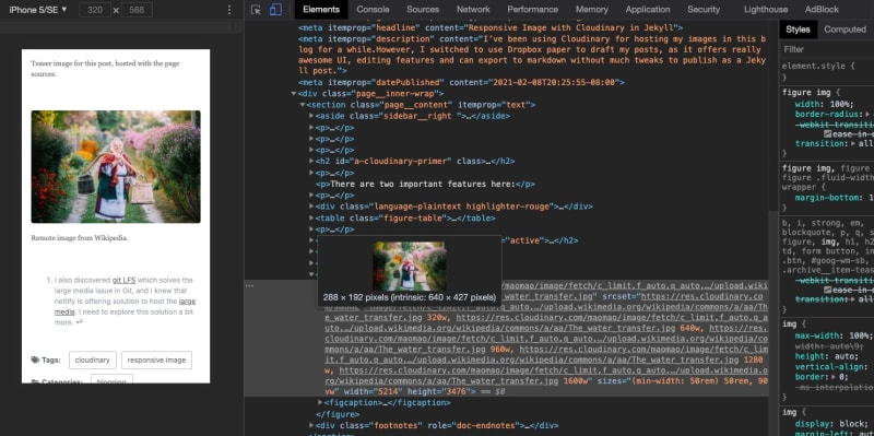
Inspecting the above image with chrome developer tools and verify the intrinsic size.
Avoid recursive fetching
Notice that if you manually uploaded an image to Cloudinary, get the link, and plug it into the cloudinary liquid tag, it will be fetched as remote media. This is a waste since the image is already hosted. It’ll be awesome if it is served directly without fetching. If you want to have this behavior, feel free to use my fork instead. It parses the image URL and sees if the delivery_type is upload, and will generate the transformations directly without fetching. I didn’t bother to make a separate gem for it, so please use the git method to add this as a Jekyll plugin. In your Gemfile:
group :jekyll_plugins do
  gem 'jekyll-cloudinary', :github => 'iveney/jekyll-cloudinary', :branch => 'master'
end
Conclusion
Inserting images in Markdown appears to be way more complicated than it appears - responsive image, styling, storage, etc. Hopefully, this solution can help to speed up your workflow so you can stay more focused on writing.
-
I also discovered git LFS which solves the large media issue in Git, and I knew that netlify is offering solution to host the large media. I need to explore this solution a bit more. ↩


Comments